


Â
Ghana Premier League champions Hearts of Oak have unveiled their new kits ahead of the upcoming 2021/22 football season.
The strips were officially unveiled to the public at a beautiful ceremony at the World Trade Centre, Accra on Thursday, September 16.
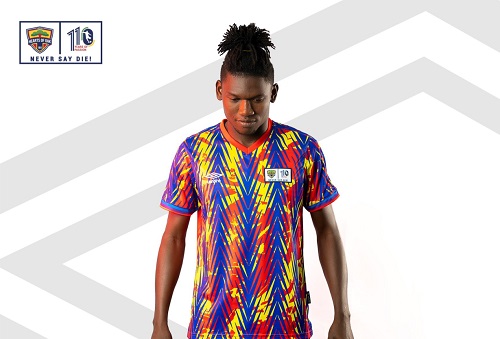
The home kit still has the rainbow colors, but this time around there are chains of blue arrows which dominate the shirt.
The away kit is a slight departure from last season’s design. It is the same white jersey with colored arrows fading, as it approaches the neck area.
The new-look also features the Hearts of Oak 110th anniversary logo.
READ ALSO:Â Photos: Hearts of Oak unveil home, away kits for 2021/22 season
Board member of the club, Vincent Sowah Odotei has revealed the meaning behind the new design.
"The jersey signifies the rekindled flame of the club. The arrowheads and flames in the jersey captures the new spirit, ambition and the heights that we want to move this club to be the most pre-eminent club in Africa," he said.
Hearts of Oak and Umbro have renewed their partnership deal until the summer of 2023.
The Ghana Premier League side in November 2018 announced a three-year deal with Umbro as their official kit partners under the agreement providing the club with training kits and equipment, off-field apparel and footwear.
The sportswear giants have supplied the club's technical and management team with Hearts of Oak branded apparel in the last two seasons.
The management of the reigning league champions and Umbro have announced a contract renewal for the next two years.
“We are pleased to announce that our partnership with Accra Hearts of Oak has been extended for a further two seasonsâ€, says David Ricketts, CEO at Umbro South Africa.