


In preparation towards every football season which last over a period of 9 months, every football club one way or the other tries to change its apparel.
Before, it wasn’t really a big deal as clubs could wear the same jersey for 3 seasons and nobody cares but ever since commercialization of football became a thing, football clubs now change jerseys every year. Basically for 2 purposes.
1) to freshen up the outlook of the team and 2) most importantly make sales on the back of the supporters to augment the finances of the football club. So the more reason why our favourite teams keep hitting us every year with something new.
Yesterday, I was at the launch of Hearts of Oak jersey. Very colourful and wonderful event. By far the biggest jersey launch ever held in Ghana.
The very first one was done by Ashgold at La Palm. That was also top notch but this Hearts one is a step further. I was happy because this is a step further in the PR business of a football club. I know Kotoko will clap back with one better than what I saw yesterday if not match it up.
Back to the issues of the reviews of both Kotoko and Hearts kits. It’s quite unfortunate we do not have the Kotoko kit in hand but what they had last year will help us solve some questions in this. Now in reviewing or comparing kits, there’s a certain criteria used and for purposes of understanding exactly what we seek to deduce. I will stick to them.
I will try as much as possible to be brutally honest with it and please don’t take it personal. It’s all part of making sure our top 2 clubs get their acts together. Have you realized when they get their house in order, everything local football gets fixed, the euphoria returns and carries all the other teams along. Let’s delve in :
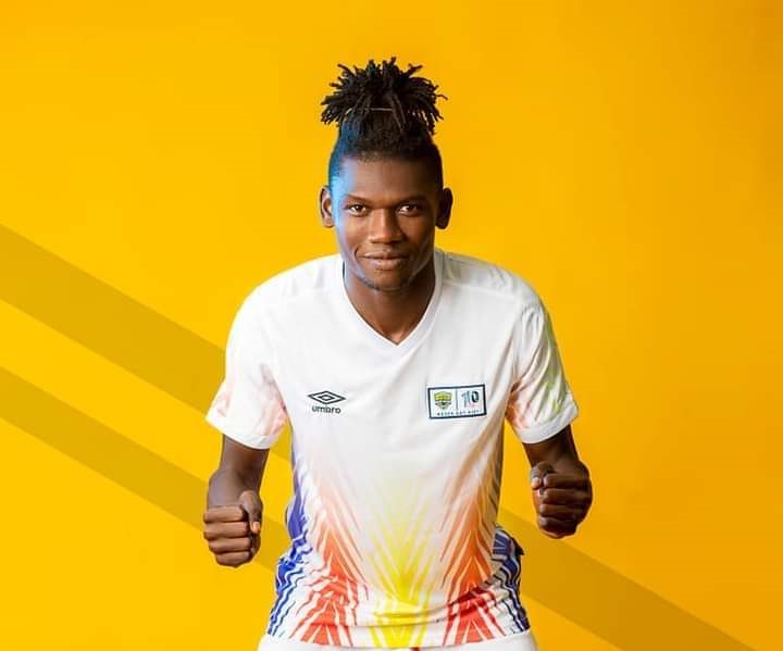
- Utilisation of core brand colours:
I must say there are only 3 clubs in Ghana that have very solid good colour combinations. Thereby if a very good kit designer decides to touch, it will always be magic. Fortunately, Accra Hearts of Oak is one of them. It’s baffling till date it’s not been utilized cum their brand colours.
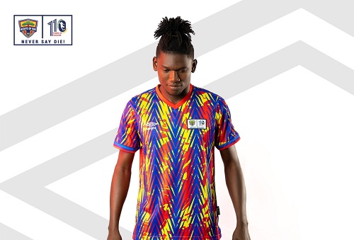
For starters, Hearts “owns†the red colour in Ghana football space. For those who don’t know, Kotoko wear red today because they copied it from Hearts of Oak and inspired them. I find it surprising to see Hearts gradually introducing the colour violet in its strips.
Unless may be they are rebranding the club that we all do not know of. Jerseys are just not any attires, they are spiritual dresses or armour for battle. As such it has roots to certain inexplicable deeds or roots of the club. Kotoko on the other hand kept its jersey in the traditional red colour. Simple all over. On this scale and as far as the utilisation of the core brand colours are concerned, I will score Kotoko ahead of Hearts in this regard for the sake of the violet or indigo colour. One many argue there’s violet in the rainbow colours but core brand colours are things no one toys with. Hearts 5 Kotoko 6
 Design aestheticsÂ
This basically has to do with the magic and beauty of the strips. This is also a close call but I will score all of them same. Kotoko went traditional which we all know. The person who worked on the Hearts design couldn’t do justice properly on the design.
The colour splash behind the arrows on the strips is too busy. Hearts colours must always get you 1000 beauty of colour combination and strips.
But the designer let us down here. Now in kit designing, it’s a real big challenge to work on clubs whose jersey colours are mono(only one colour) like Kotoko, like Real Madrid. It’s really tough. So usually it’s the style that sees significant changes. Because you can’t play around the colour due to lack of supporting core brand colours to go with it. Hearts 5 Kotoko 5
Design messageÂ
Every kit has an inspiration or story behind it. Kotoko went traditional with adinkra symbols. Of which we all know what it stands for and as people what it means for us and our heritage. For Hearts, at yesterday’s event, board member Odotei Sowah says the arrows in front means to hit your target and that when Hearts put it on it will spur them on to hit targets and objectives set.
The same applies to any fan who wears it will be inspired to achieve whatever they set their minds to. I will score Kotoko ahead of Hearts in this stakes too.
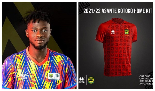
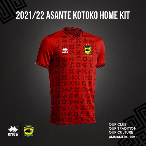
Reason, like I said earlier we all know what adinkra symbols stand for and how it tends visually extols the Ghanaian culture to the world. I find Mr Odotei’s reason for the meaning behind their design very vague and this was an opportunity to bring back a “freshened†jersey worn in 1911 or the one worn by the team 50 or 55 years ago since it’s a commemorative year for the club (110 years in existence) .. Another reason I’m scoring Kotoko ahead of Hearts too is this, Kotoko have a theme for their jerseys this year with the moniker “amam3r3†which goes in tandem with the jersey design but Hearts doesn’t. Kotoko 7 Hearts 5.
StyleÂ
Basically, this has to do with the way jerseys are crafted and the small minute things on the jerseys that makes it unique. So much so that when you pick it and see it anywhere you know this is Hearts or Kotoko jersey.
Last year apart from Dreams FC that had a solid modern logo made by me and my team at Mayniak Sportswear, none of the other clubs had something close. We used an ultra-modern one called TPU. Whereas most of the clubs had just their logo sublimated on the fabric.
In jersey manufacturing that’s very basic. As top clubs, I believe Errea and Umbro must give our two clubs ultra modern stuff. Both Hearts and Kotoko go a V neck this time. I don’t think Umbro did justice to the sleeve band of Hearts. At the tail ends of the sleeves of the jerseys, elastic bands should have been used and not to sublimate the design.
That is only permissible if the design is a bit longer on the sleeves. But once is short as seen, Umbro should have used bands. That’s the best and modern way of doing things now. Kotoko goes for designed sleeve. Hoping it comes in an elastic band or a more befitting material.
I am very sure Kotoko will get a sublimated logo on the jersey again. Hearts went for a woven label kind of logo this time but I don’t know how to describe it. It’s a no-no as far as Kit rules by FIFA/UEFA are concern.
I know CAF will let it pass because they know we fall short of the knowledge in kit production on the continent. It's not easy to be 110 years and so I get the point where the club wants to celebrate that milestone with the kit but whoever brought the idea to place the commemorative logo beside the club logo didn't do justice to it. That commemorative logo could have been placed at the top back neck of the shirt or could have been nicely incorporated or merged with the club logo which would have been great.
Go and search for the commemorative logo used by the club in 2011 to celebrate the 100 years. That logo was solid. The club had it wrong this time. The size of the logos is small. I think it's about 4 or 5cm in height, which in other jurisdiction like UEFA it would have been rejected to be used for any competition.
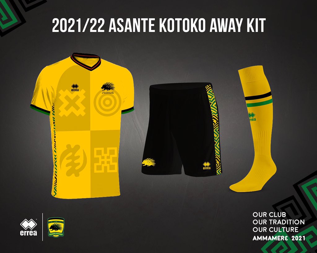
Logos must be about 7 to 8cm in height and with a corresponding length. On the other hand, Kotoko nicely incorporates their “Club of the century†tag on their away jersey. Very top notch. In this regard, I will score Kotoko 7 and Hearts 6.
FabricsÂ
Umbro and Errea used a fabric environmentally friendly with our weather conditions and most importantly as far players being on the pitch is concerned. I expect the same fabrics to be used again .. I will score both a draw too here !
Closing remarks
I think anything new expected or received in great anticipation and timely makes it looks top notch. I get the buzz Hearts fans are feeling all over. It’s good but I must say last year’s project was better than this years project. Same applies to Kotoko. The only thing better what they had last year is the new away shirt and how it creatively projects the Ashanti kingdom colours …
I feel Hearts jerseys were rushed. If it was any other season, I would have forgiven them but once it’s your commemorative year, you need to make a statement with it. Then again going forward, I think Hearts shouldn't leave the designing of the kit to Umbro, they lack it.
Designs should be done by local people and then sent to them to produce. It looks to me, Umbro just found some templates and sent to Hearts for them to choose.
All in all I scored Hearts last jersey 75% when it was launched. I’m scoring this year’s jersey 60%. I scored Kotoko’s last year’s jersey at 70%. I am still keeping it 70% and waiting to see it launched. Could even score it at 75% if it meets properly after the launch but for now it’s at 70% for me.
Thanks you.
By AR Zakari MCIM